Your Instagram profile has about 3 seconds to make a first impression.
In those 3 seconds, people aren’t reading your bio or your captions. They’re looking at your colors.
If your feed looks consistent and clean, people trust it. If it looks random and patchy, they scroll past — no matter how good your content actually is.
According to research published in the Journal of Business Research, color influences up to 62–90% of a person’s first impression of a brand. On Instagram, where over 2 billion people scroll every month (Statista, 2024), that first impression is almost entirely visual.
This guide gives you a clear, research-backed system to build a professional Instagram color palette — even if you have zero design experience.
Here’s what you’ll learn:
- Why color consistency affects your growth more than posting frequency
- The 60-30-10 rule that luxury brands use — and how to apply it on Instagram
- Color psychology so you can pick shades that actually match your brand personality
- 5 ready-to-use palette styles with exact HEX codes
- Free tools to build, preview, and export your palette in minutes
Let’s get started.
Why Color Consistency Matters More Than You Think
Most creators focus on content quality — better photos, better captions, stronger hooks. That all matters. But here’s what most people miss.
Before a visitor reads a single word on your profile, their brain has already formed an opinion about it.
A 2021 study by Lucidpress found that consistent brand presentation increases revenue by up to 23% across platforms. On Instagram specifically, your feed grid — the 9-post layout someone sees when they first visit your profile — works like a storefront window. People decide whether to follow based on what they see in that window.
Here’s the science: the human brain processes visuals 60,000 times faster than text (MIT, 2014). The moment someone opens your profile, their brain instantly scans for patterns. Consistent colors = a recognizable system = trustworthy and professional. Random colors = noise = disengagement.
The bottom line: People follow accounts that feel credible, not just accounts that post good content.
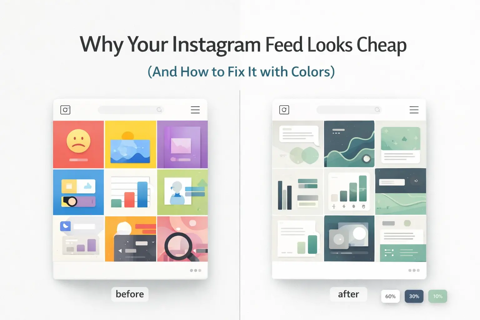
What Makes a Feed Look Cheap
Most feeds look unprofessional for the same three reasons. Once you know them, they’re impossible to unsee.
1. No color hierarchy. Every post is competing for attention because nothing is organized. Bright colors, dark colors, and neutrals show up randomly with no system connecting them.
2. Too many colors. Research from the Nielsen Norman Group shows that more than 5 dominant colors in a single visual space causes mental fatigue. Your Instagram feed works the same way.
3. No tonal consistency. Two posts can use completely different colors and still look cohesive — but only if they share the same tone. All warm, or all cool, or all muted. The moment you mix a warm-toned post with a cool-toned one, the feed falls apart even if each post looks fine on its own.
All three problems are fixed by one simple framework.
The 60-30-10 Rule: How Professional Designers Balance Color

The 60-30-10 rule started in interior design in the mid-20th century. Interior designers, graphic designers, and brand strategists all use it for one reason — it reliably produces visual balance without guesswork.
The idea is simple. Your visual space is split into three color groups based on how much of the space each color takes up.
60% — The Base Color (Your Background)
This is the color that appears most often. On Instagram, it shows up in:
- Post and carousel backgrounds
- Reel cover thumbnails
- Story highlight covers
What works here: Neutral tones. Pure white (#FFFFFF) looks harsh and clinical on most screens. Instead, go for softer options like off-white (#F5F5F0), warm ivory (#FAF7F2), light grey (#F0F0EE), or warm sand (#F2EDE4). These feel premium without feeling sterile.
Avoid saturated or bright colors as your base — seeing them across your whole feed creates visual fatigue fast.
30% — The Brand Color (Your Identity)
This is the color that carries your brand personality. It appears in:
- Text overlays and headlines
- Shapes, frames, and graphic elements
- Carousel section dividers
This color should contrast clearly against your base while staying tonally compatible with it. A warm ivory base, for example, pairs naturally with warm taupe or deep olive — but would look off against a cold grey-blue.
10% — The Accent Color (Your Attention Signal)
The smallest portion, but the most powerful one. Used specifically for:
- Calls-to-action (“Save this,” “Link in bio,” “Swipe →”)
- Key statistics or highlights you want to emphasize
- Product spotlights or important announcements
Why so little? The accent color works because it’s rare. When it appears, the eye goes straight to it. That’s exactly what you want for CTAs. Use it everywhere and it stops being a signal — it just becomes another color blending into the background.
This is why brands like Chanel, Apple, and Rolex use their signature accent colors sparingly — every appearance feels intentional.
Color Psychology: Pick Colors That Match Your Brand
Color choices aren’t arbitrary — they trigger real emotional responses. Decades of consumer psychology research confirm that specific colors reliably create specific feelings. Here’s a practical breakdown for Instagram:
Blue — Trust, Calm, Authority
Used by: LinkedIn, PayPal, Samsung, Facebook Best for: Finance, education, healthcare, tech, coaching. Recommended shades: Navy (#1B3A6B), Steel Blue (#4A7DB5), Powder Blue (#B8D4E8)
Green — Growth, Health, Nature, Freshness
Used by: Whole Foods, Spotify, Tropicana Best for: Wellness, fitness, sustainability, food, personal finance Recommended shades: Sage (#7D9E7D), Forest Green (#2D6A4F), Mint (#A8D5BA)
Black and Charcoal — Premium, Bold, Luxury
Used by: Chanel, Nike, Apple Best for: Fashion, luxury products, photography, premium services. Recommended shades: Rich Black (#0A0A0A), Charcoal (#2C2C2E), Off-Black (#1A1A1A)
Warm Earth Tones — Authentic, Warm, Reliable
Used by: Glossier, Aesop, Patagonia Best for: Lifestyle, beauty, wellness, food, travel. Recommended shades: Warm Beige (#E8DCCB), Terracotta (#C2714F), Caramel (#A0714F)
Pink and Coral — Playful, Modern, Energetic
Used by: Airbnb (coral), Glossier, Bumble Best for: Beauty, fashion, lifestyle, food, dating. Recommended shades: Dusty Rose (#C9A0A0), Blush (#F2C4CE), Coral (#FF6B6B)
Yellow and Gold — Optimism, Creativity, Energy
Used by: IKEA, McDonald’s, Snapchat Best for: Food, children’s content, coaching, creativity. Recommended shades: Warm Gold (#D4AF37), Butter Yellow (#FFE57A), Amber (#FFBF00)
5 Proven Instagram Palette Styles With Exact HEX Codes
These palettes are based on what consistently works across high-performing Instagram accounts in different niches.
1. The Luxury Minimalist
Best for: Fashion, beauty, premium services, interior design Mood: Expensive, calm, editorial
| Role | Color Name | HEX |
|---|---|---|
| 60% Base | Warm Ivory | #FAF7F2 |
| 30% Brand | Charcoal | #2C2C2E |
| 10% Accent | Deep Olive | #5C6B3A |
Why it works: The contrast between warm ivory and near-black charcoal creates a high-end editorial look — similar to luxury magazine layouts. The deep olive accent adds depth without breaking the premium feel.
2. The Bold Modern
Best for: Tech, fitness, startups, Gen Z audiences. Mood: High energy, confident, forward-looking
| Role | Color Name | HEX |
|---|---|---|
| 60% Base | Off-White | #F5F5F0 |
| 30% Brand | Electric Green | #39FF14 |
| 10% Accent | Deep Navy | #0A1628 |
Why it works: Inspired by brands like Spotify and Nike’s digital campaigns. High contrast with a neon accent feels modern and bold without looking chaotic.
3. The Calm Creator
Best for: Wellness, coaching, education, mental health, sustainability Mood: Trustworthy, warm, approachable
| Role | Color Name | HEX |
|---|---|---|
| 60% Base | Soft Sand | #F2EDE4 |
| 30% Brand | Warm Taupe | #8C7B6B |
| 10% Accent | Sage Green | #7D9E7D |
Why it works: Earth tones trigger associations with nature, safety, and reliability. According to the Nielsen Norman Group (2022), this palette style consistently outperforms brighter alternatives in trust-based niches like coaching and wellness.
4. The Soft Feminine
Best for: Beauty, fashion, lifestyle, food, travel Mood: Elegant, warm, personal
| Role | Color Name | HEX |
|---|---|---|
| 60% Base | Blush White | #FFF0F0 |
| 30% Brand | Dusty Mauve | #B07090 |
| 10% Accent | Antique Gold | #C9A84C |
Why it works: Muted, desaturated tones look more sophisticated than bright pinks. The gold accent adds a premium signal to an otherwise soft palette.
5. The Dark Premium
Best for: Photography, luxury fashion, music, automotive, nightlife Mood: Dramatic, powerful, premium
| Role | Color Name | HEX |
|---|---|---|
| 60% Base | Deep Charcoal | #1C1C1E |
| 30% Brand | Warm Beige | #D4C5B0 |
| 10% Accent | Burnt Gold | #C4962A |
Why it works: Dark-dominant feeds are less common on Instagram, which naturally makes them stand out. The warm beige prevents the cold, clinical feeling that pure black creates.
How Gradients Make Your Feed Look More Premium
Once your flat color palette is set, gradients are the next step to elevate your design quality.
A gradient is a smooth blend between two or more colors. In digital design, gradients increase what designers call visual dwell time — the amount of time a person spends looking at a piece of content. The eye naturally follows color transitions, which keeps people engaged slightly longer with each post.
The 3 Types of Gradients for Instagram
Linear Gradient — A straight blend from one color to another. The most common type. Works great for text backgrounds, carousel slides, and reel covers. Example: warm ivory (#FAF7F2) blending into soft grey (#E8E8E4).
Radial Gradient — Blends from the center outward, creating a spotlight or glow effect. Best for product highlights and featured cover images.
Diagonal Gradient — A 45-degree blend that adds a sense of movement and energy. Works especially well for fashion, fitness, and lifestyle content.
The golden rule with gradients: Only blend colors from your existing palette. Never introduce a new color through a gradient — it breaks your visual system. The goal is to add depth, not new colors.
Creating On-Brand Gradients With the Resourceflix Gradient Generator
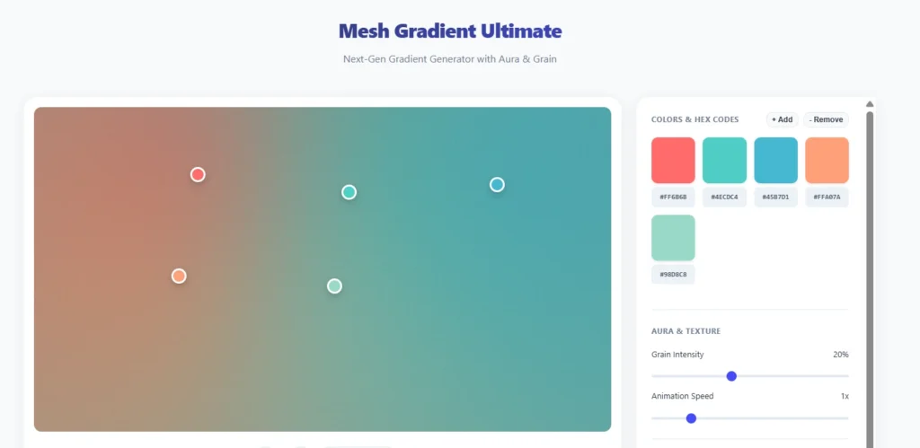
Once your palette is ready, the Resourceflix Gradient Generator is the fastest way to turn your HEX codes into polished, professional-grade gradients — with no design software needed.
Here’s what the tool lets you do:
Choose your gradient type. Linear, radial, or conic — you pick the type and the tool builds it live. Each gives a different visual result, so you can test all three before committing to one.
Control the angle and direction. For linear gradients, you can set the exact angle — 0°, 45°, 90°, or any custom degree. This controls how the color flows across your design and makes a noticeable difference in how dynamic the final output feels.
Add multiple color stops. You’re not limited to two colors. Add several stops along the gradient and position each one exactly where you want it. This is what separates a flat two-color blend from a gradient that actually looks crafted.
Live preview as you build. Every change updates instantly in the preview. No exporting and re-importing to see if it looks right — what you see is what you get.
Copy the CSS code directly. This is particularly useful if you’re also managing a website or landing page alongside your Instagram. Once your gradient is ready, copy the CSS and paste it straight into Canva, your web builder, or any design tool that accepts CSS values.
No sign-up required. Open the tool and start building immediately. No accounts, no paywalls.
The workflow is clean: build your palette in the Color Palette Generator, bring your HEX codes into the Gradient Generator, and you have a finished, on-brand gradient ready for your Instagram content in under 5 minutes.
The 5-Day Feed Fix Plan
You don’t need to delete your old posts. This plan works by gradually shifting your new content toward your color system — starting from your very next post.
Day 1 — Audit Your Current Feed
Screenshot your profile and look at your 9 most recent posts. Count how many different background colors appear. If it’s more than 3, your palette is inconsistent. This step is just about seeing the gap clearly before you close it.
Day 2 — Choose Your Palette
Use the 60-30-10 framework and pick from the 5 palette styles above. Go to the Resourceflix Color Palette Generator, browse presets by mood or upload your logo to extract your brand colors, and save your three HEX codes to your phone notes before you design anything.
Day 3 — Design Your First 3 Consistent Posts
Follow this rotation:
- Post 1: Primarily your 60% base color — clean background, simple layout
- Post 2: Your 30% brand color as the main visual element — bold text or a strong graphic
- Post 3: Feature your 10% accent color on the CTA — the button, the arrow, the highlight
After just these three posts, your grid will already start to feel more intentional.
Day 4 — Fix Your Reel Cover Thumbnails
This is the most commonly overlooked step. Reel covers appear directly in your grid. If they don’t match your palette, they break the visual pattern even when all your regular posts are consistent. Create simple branded cover templates using your base and brand colors.
Day 5 — Update Your Highlight Covers
Highlight covers sit permanently at the top of your profile and are one of the first things visitors notice. Create a matching set using your 30% brand color or 10% accent color as the background. It takes about 30 minutes and makes your profile look significantly more polished.
Common Color Mistakes to Avoid
Using Pure White as Your Base
Pure white (#FFFFFF) looks harsh on most screens and creates a clinical, corporate feel. Switching to off-white (#F5F5F0) or warm ivory (#FAF7F2) is a small change that makes a real difference in how premium your feed feels.
Using Your Accent Color Too Often
If your 10% accent appears in every post, it loses its purpose. It stops being a visual signal and just becomes background noise. Keep it reserved for CTAs and key moments only.
Mixing Warm and Cool Tones
This is the most common mistake, and it’s subtle. You can use different colors and still look cohesive — but only if they share the same temperature. Mixing a warm beige post with a cool blue-grey post breaks the visual rhythm of your feed even if each post looks fine in isolation.
Changing Your Palette Too Often
Research published in the Journal of Consumer Psychology (2019) shows it takes 5–7 consistent exposures before someone starts associating a color with a brand. Changing your palette every few weeks resets that process completely. Commit to one palette for at least 3 months before evaluating if it’s working.
Ignoring Accessibility
According to the World Health Organization, around 300 million people have some form of color vision deficiency. Before finalizing your palette, check that your text-to-background contrast meets the WCAG AA standard (minimum ratio of 4.5:1 for normal text). The free WebAIM Contrast Checker at webaim.org lets you verify this in seconds.
Tools to Build Your Instagram Color Palette
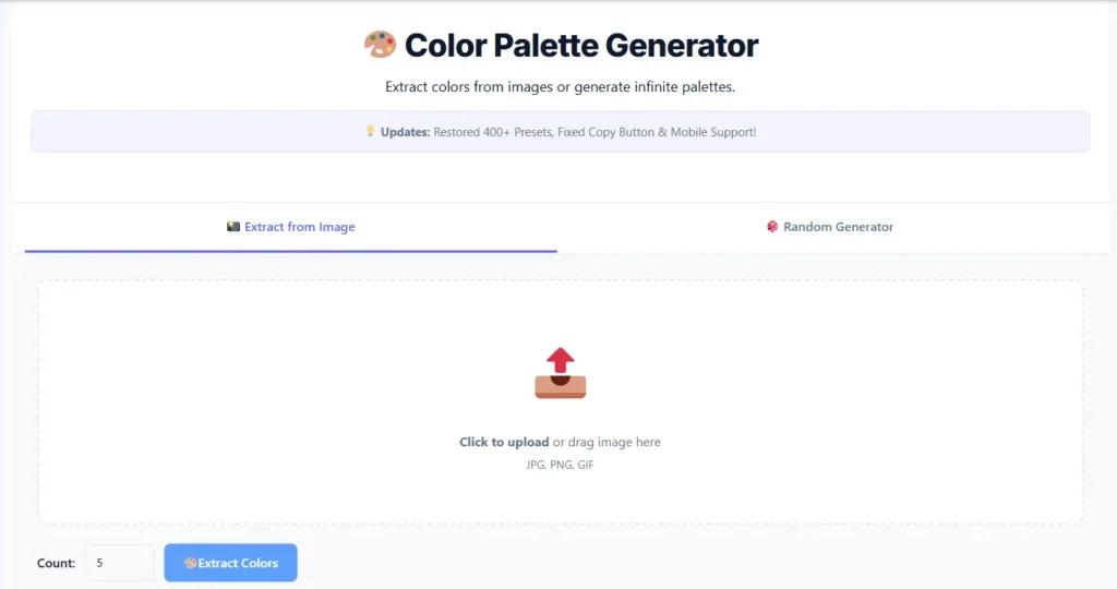
Resourceflix — Start Here
Color Palette Generator — The most practical free palette tool for Instagram creators. Here’s what makes it stand out:
Extract colors from any image. Upload your logo, a brand photo, or any reference image (JPG, PNG, or GIF) and the tool pulls out the dominant colors automatically. This is the fastest way to build a palette that already feels connected to your existing brand.
400+ preset palettes sorted by mood and niche. Categories include Luxury, Pastel, Bold, Nature, Tech, Earthy, and Food. Browse and star your favorites to come back to them.
Generate 3 to 10 colors at once. Three is ideal for Instagram — one per 60-30-10 role — but you can expand to 5 or more for a full brand system.
Export as PNG, CSS, JSON, or copy the HEX codes. All four options available in one click, depending on what you need.
Color blindness simulator built in. Preview your palette through the eyes of someone with Protanopia, Deuteranopia, Tritanopia, or Achromatopsia before you commit. Most free tools skip this entirely.
Edit individual colors. Adjust any single shade without regenerating the whole palette from scratch.
Undo/redo and full palette history. Everything you build is saved so you can go back and compare different directions.
Gradient Generator — Once your palette is locked in, use this tool to create CSS-ready gradients from your HEX codes. Choose gradient type, control the angle and color stops, preview live, and copy the CSS directly. No design software needed. Full details in the gradient section above.
Other Useful Free Tools
Adobe Color — Useful for exploring color harmony rules like complementary, triadic, and analogous pairings. Also includes an accessibility checker.
Color Hunt — A community-curated palette library, filterable by mood and style. Good for getting initial inspiration before you build your own.
WebAIM Contrast Checker (webaim.org) — Paste two HEX codes and instantly see if your text-to-background contrast meets accessibility standards.
Frequently Asked Questions
How many colors should my Instagram palette have?
Three is the professional standard — one for each role in the 60-30-10 system. You can add a fourth neutral like warm grey for flexibility, but going beyond that usually creates inconsistency rather than variety.
Should my Instagram palette match my website and logo?
Yes. This is called brand color consistency, and it’s a core principle of brand identity. When someone moves from your Instagram to your website, the visual experience should feel seamless. If your website uses deep navy and gold, your Instagram should reflect that too.
Can I use black and white as my full palette?
Yes, and it can work very well — especially for photography, fashion, and premium niches. If you go monochromatic, compensate by varying the texture, layout, and composition of your posts to keep the feed visually interesting.
How do I choose colors if I already have a logo?
Upload your logo directly to the Resourceflix Color Palette Generator. It will extract the exact HEX codes from your logo automatically. Build your 60-30-10 palette around those colors to keep everything aligned with your existing brand.
How long before my feed looks consistent?
Your feed starts to feel cohesive once the 9 most recent posts — the first page someone sees when they visit your profile — all follow the same palette. With daily posting, that’s 9 days. With 3 posts per week, about 3 weeks.
Do gradients still look good on Instagram in 2026?
Yes — when used correctly. The key is subtlety. Soft, on-brand gradients used as post backgrounds or text overlays look polished and modern. Loud, multi-color gradients with no connection to your palette look dated. Keep them tied to your palette and the result is always clean.
Final Thoughts
Color consistency is one of the simplest changes you can make to your Instagram — and one of the highest-impact ones. It doesn’t require more content, more posting, or more time. It just requires a system applied consistently.
The 60-30-10 rule gives you that system. Color psychology helps you pick the right colors for your niche. And the right tools make sure everything stays consistent without needing a professional designer.
Start by building your palette at the Resourceflix Color Palette Generator. Then use the Resourceflix Gradient Generator to add depth to your designs with professional, on-brand gradients.
Pick your three colors. Save the HEX codes. Apply them consistently.

